Role: Senior Product Designer
Charter: Acquisition
Working with: Sharad Singh (Associate Product Designer)
Client:
Zee Entertainment
Year:
2022
The Challenge
The cost of acquiring new users was exorbitant hovering around Rs560 fluctuating with marketing spend of the month, at an average revenue per user was at Rs699
Lacked a clear PRD
Stakeholders had conflicting views on timelines, rewards, and feasibility
Impact
Designed and launched the first referral program for an OTT.
Developed a design brief format that became standard across our design team

Userflow exploring the ideal journey of a user
Context and Timelines
Referral was chosen as a growth lever to reduce dependence on paid acquisition. The project was being researched when I joined the charter, who had completed the competitor analysis for various referral programs. My responsibility was to aid in launching the feature, with a desirable experience.
The PM wanted to fast track the project and proposed a 7 day sprint to launch the feature. The ask was bold, but I didn’t want to shoot down the idea this early into the charter. I called for a white boarding session to map out the “happy flow”, clarifying the scope of work for front end and backend engineering leads. We jointly agreed to a new timeline of 6 months as the backend team needed the time to create a fresh referral engine.

Referral happy flow
Design brief
As the requirement wasn’t clear and repeated followups on PRD wasn’t fruitful, I chose to share a design brief that encapsulated all the information I needed as a designer, where I articulated the assumptions I was making and the information that was not clear to me. This was shared with the PM and the relevant stakeholders requesting clarity. This later developed into a formal Design brief document that was adopted as a org wide practice by all the designers.
A key component of the brief was the success metric which was defined as reduction in CACQ by 50% it was clear that this was an audacious goal to have, and one everyone wanted to achieve differently. The PM wanted to create a contest with an iphone as a reward, awarding it to the person with the most amount of referrals at the end of a month. Business wanted to use Amazon vouchers, as a reward to test the mechanism and control the denominations. My proposal was to split the Rs250 between the two parties, to incentivise action. I proposed a Rs 200 discount to the users joining via a referral link, and a month of premium membership free for users who make the referral. the current cost of subscription was at Rs599/year bringing its per month cost close to Rs58 and the total CAC to 258rs.

Design brief sample
Stakeholder Alignement
The product, development and design team had different ideas on how the referral model should work. I facilitated cross functional alignment by conducting a workshop, to ideate on 2 key screens in the flow by means of low fidelity wireframes. - Referral landing screen - Referee landing screen Having all the stakeholders in one room allowed us to have quick reviews on feasibility from a development POV, Viability of the timeline as well as the most desirable experiences.

Sketches form the stakeholder workshop
Prototyping and Feedback
I built a wireframe prototype to gain buy in on the journey some of the assumptions we were working with such as the reward mechanism etc.
Feedback suggested removing the onboarding tutorial entirely to reduce friction. The team’s concern was rooted in the 'more clicks lead to more drop-off' principle, I believed that the tutorial was vital for user comprehension of the referral program. To bridge this gap, I redesigned the interaction into an automated, story-style experience that required zero clicks, while provisioning to skip the tutorial when necessary. Leading users seamlessly to the landing page. By prototyping this 'passive' education model, the team's concerns regarding drop offs while retaining the necessary context was addressed . This was so well-received that it evolved into a plan to use celebrity-led video walkthroughs rather than static text.

Prototype for dogfooding
User Testing
We tested this version with a set of 12 users with help of our in house research team. feedback indicated users wanted wanted to know what content the platform had to offer before making a purchase decision. This took us back to the drawing board the risk of sampling with the current methods lay in the users forgetting about the referral flow. I redesigned the referee landing page to include more content and allow for sampling on the same page without taking them to the homepage, thus preserving the referral context.
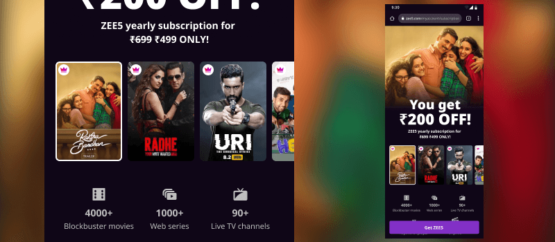
Referree landing page built, based on user feedback
The Experience
We designed supporting touch points (completion, notifications, redemption) to ensure continuity across the referral flow and got the screens ready for development using the design system.

Onboarding tutorial
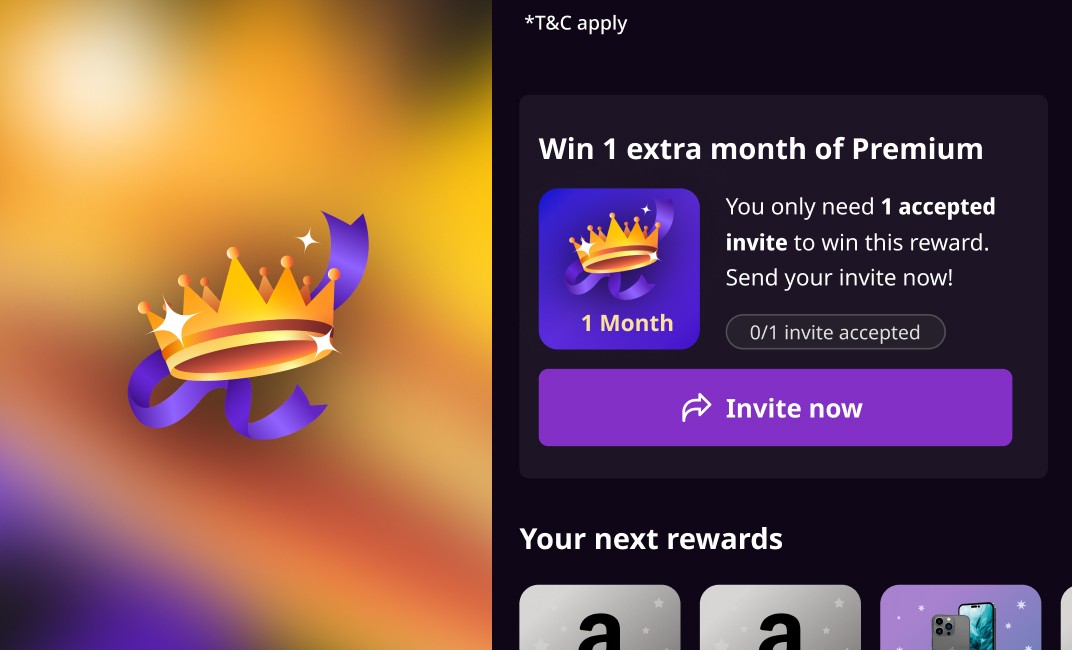
Referral card, linked to the reward incentive

Upcoming rewards

Referree landing page

Referree landing page
Change of Plans
The CEO asked for an expedition in timelines, 4 month development was crunched to launch in 15 days, the focus shifted from getting the experience right to getting the feature to production. It was clear that the development team could only develop a portion of the flow.
When the decision to launch without the features introduced due to user feedback was made I had concerns over meeting business objectives. I decided to escalate the matter to the Design director and the Head of design. The consensus reached was to go live with what we have right now. and backfill the rest as design backlog. Changes were required on the existing referral screen in order to remove the onboarding components that linked to the referral landing page. The feature was launched as a partial experience. and had an underwhelming response.

Strip down version, taken live
User - feedback
I requested the research team to conducted another user test on the build that went live as well as an in-depth foundational research to understand consumer psychology around recommending content and OTT, This research was conducted with 23 participants but the research team. Due to organisational changes I needed to hand over the project to a fellow designer and move to a different charter.

Research being conducted by the team
Redesign
When the Research findings came about we learnt how “Sharing” was a key component in referral and how recommending content was an underlying need the users had. I redesigned the referral page keeping in mind the insights and handed to the acquisition to develop further.

Redesigned approach to referral based on sharing behaviour, as found in research
Learnings
When the Research findings came about we learnt how “Sharing” was a key component in referral and how recommending content was an underlying need the users had. I redesigned the referral page keeping in mind the insights and handed to the acquisition to develop further.