Redesigning Search
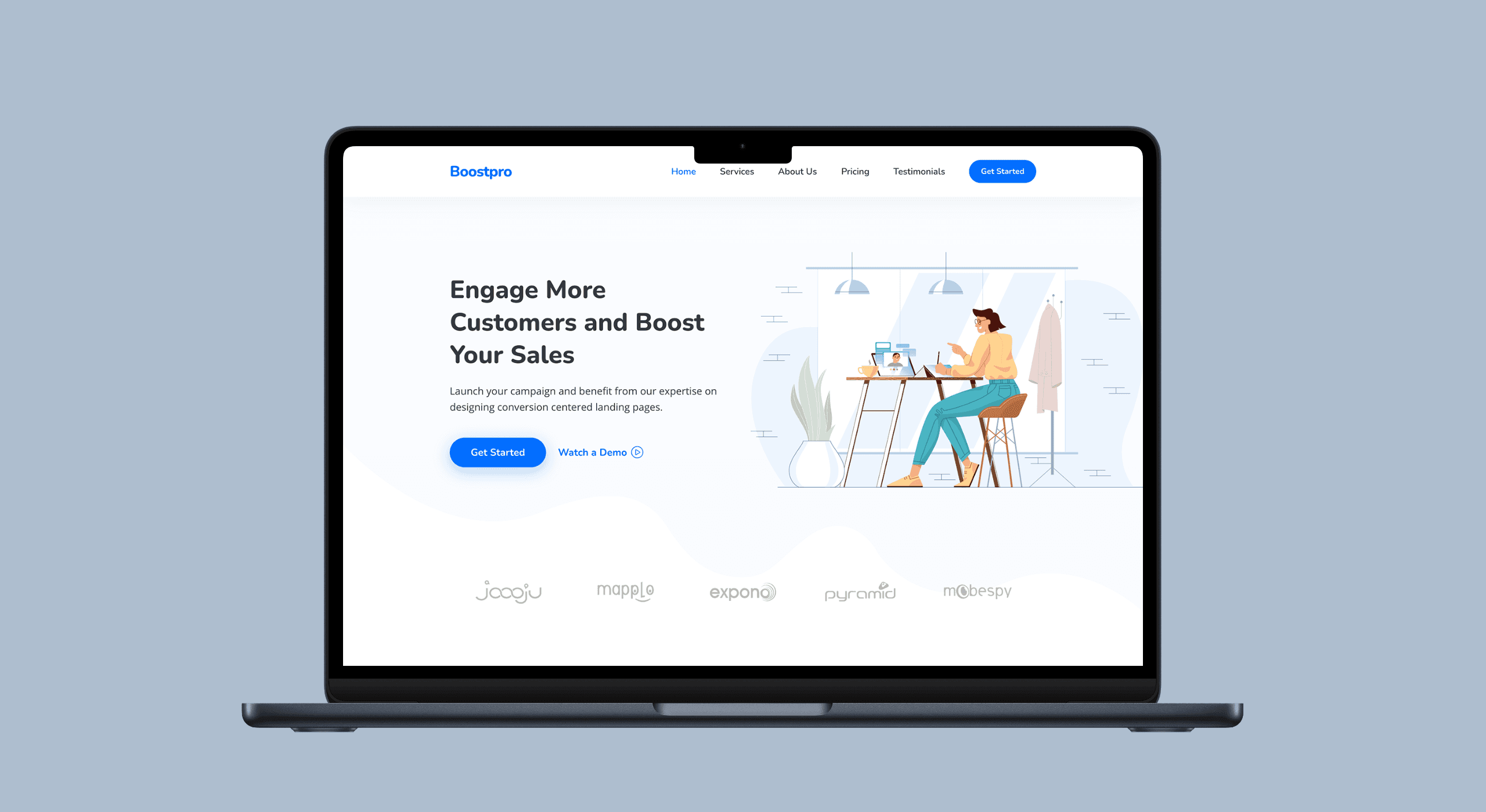
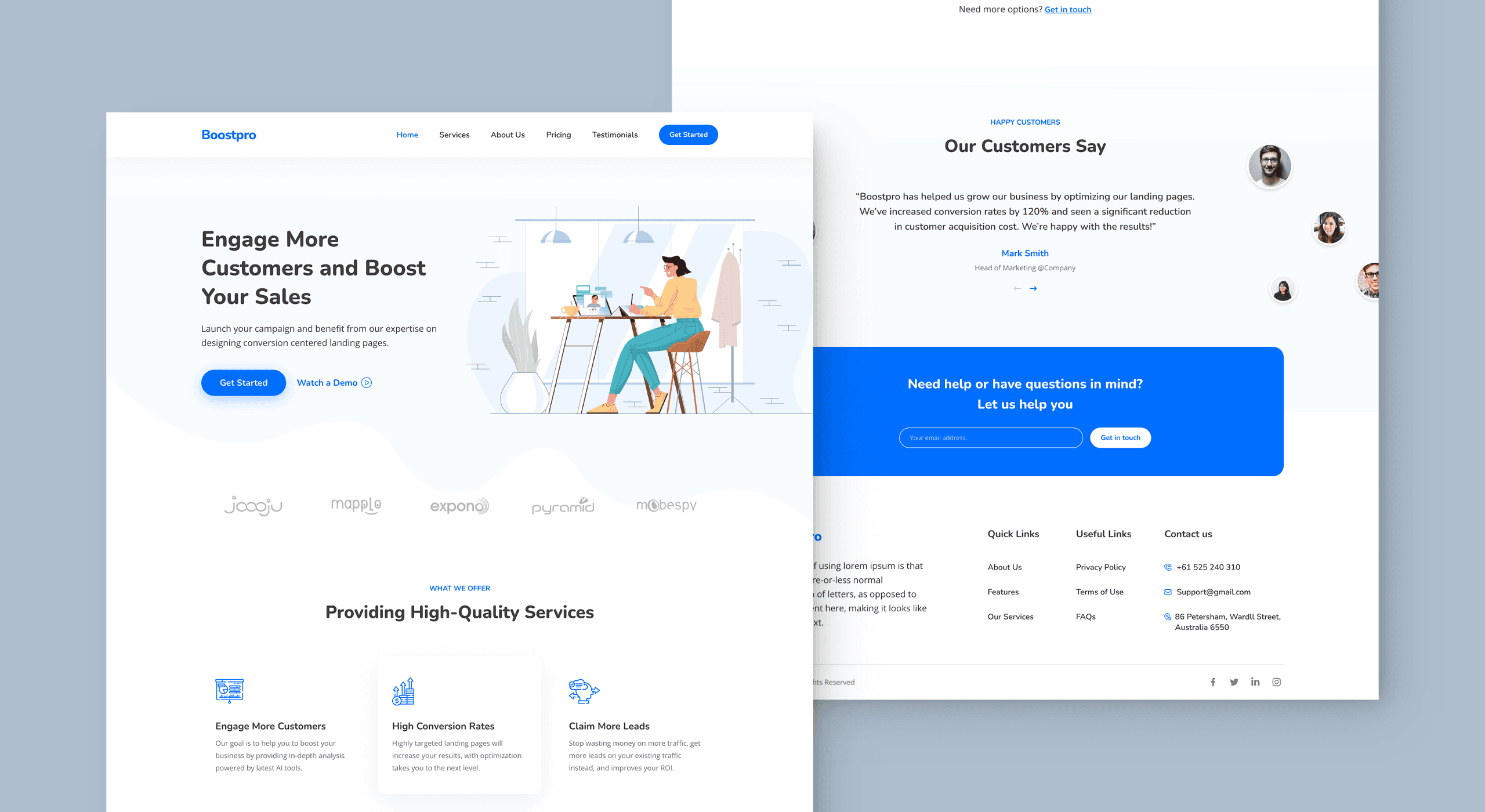
The objective of this case study is to examine a landing page designed to increase customer engagement and boost sales. The landing page is part of a digital marketing campaign aimed at promoting a product or service to a specific target audience.
Client:
Zee Entertainment
Role:
Sr. Product Designer
Year:
2023

The Challenge
Search was a critical but stagnant flow—unchanged for years due to its impact on a key metric: Search CTR.
High oversight — every change required business approval
Underutilised insights — strong data existed but wasn’t translated into product
Low iteration — risk aversion limited experimentation
Underperformance — CTR at 73% vs ~80% industry benchmark
Process
Redesigned and launched AI-powered search
Improved Search CTR from 79% → 81%
Operationalised data and research into product decisions
Influenced multiple downstream features (e.g. language rails, content formats)
Brought previously unprioritised user problems onto the roadmap
Solution
I used a hackathon as a wedge to bypass approval constraints and prototype a new direction.
The initial proposal was a chat-based interface or natural language search search based on past failures and user expectation (Jacobs law), I challenged this direction. Alternatively I designed a tappable prompt component, subtly educating the user about long form text being available instead of just keywords.
We built the search experiece in a record time of 2 days.
Key takeaways
Based on the hackathon success, leadership wanted to launch to production,
Key Constraints & Decisions
AI search was gated behind an opt-in entry (banner) to avoid business exposure
I pushed for default entry or toggle to improve discovery (top-of-funnel), but this was deprioritised due to dev constraints
This trade-off directly impacted feature adoption—validated later in research.
Feature was launched to 5% of iOS users as an experiment
Key takeaways
Strong early signals led leadership to expand the feature scope:
Merge AI and standard search into a single experience
Introduce new content rails to drive consumption
Enable advertising and branding opportunities
Reduce result latency
Create a distinct visual identity for search
Make the experience feel more conversational
The PM scoped delivery screen-by-screen to optimise development bandwidth. I chose to design the end-to-end flow to ensure a coherent experience.
I defined the landing page structure while Somanshu handled its detailing.
In parallel, I partnered with the data analyst to surface long-standing user issues and combined them with research insights.
This allowed me to go beyond the initial scope and solve for validated user problems across the results and typing states. The solution was well received and successfully added to the roadmap.